
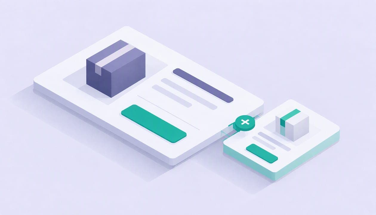
An order bump is a single checkbox or one-click add-on offered on the same checkout page as the main purchase, before the customer pays. Done well, it can raise average order value while keeping friction low because the customer stays on the page and avoids starting a new decision process. Below, we break down real examples by seller type, the design rules that make them convert, and how to measure whether yours is actually working.
TL;DR:
- Match each bump to the cart, offering a screen protector with a phone or replay access with a ticket, and keep its price low.
- Baymard found 66% of users exposed to a separate sales step showed extreme frustration, so present the extra inline during payment.
- Compare average order value and checkout conversion between exposed and control groups, then subtract transaction and platform fees before judging net revenue.
- Show the bump only when it fits the item, cart value, or category; lead with one benefit, and use urgency only for a real deadline.
Table of Contents
- What is an order bump and when do you use it
- Order bump vs. upsell and cross-sell: what's the real difference
- Ready-to-use order bump examples by seller type
- How to design an order bump that actually converts
- How to measure whether your order bump is working
- UX mistakes that turn a good bump into a bad one
- Add order bumps to your own checkout with Constants
- FAQ
- Sources
What is an order bump and when do you use it
An order bump shows up on the exact same step where the customer is already entering payment details. They see one relevant extra, check a box or tap a button, and it is added to the order total before checkout completes. No new page, no new form, no second decision tree.
That one-click nature is what separates a bump from almost every other revenue tactic. The customer has already said yes to buying something. You are not asking them to reconsider, you are asking them to add a small, obvious complement while their wallet is already out.
Typical use cases include accessories tied to a physical product, a quick digital companion to a course or template, or a scheduling add-on next to a booking. The common thread: the bump should take less mental effort to accept than to skip.

Order bump vs. upsell and cross-sell: what's the real difference
These three terms get used interchangeably, but they behave differently in the funnel.
- An upsell offers a higher-priced or premium version of what the customer is already buying, often right after checkout or on the same step: think "upgrade to the extended warranty."
- A cross-sell shows complementary items anywhere in the shopping journey, often on a product page or in a cart: "customers who bought this phone also bought this case."
- An order bump is a single-step, low-friction addition presented only during checkout, usually as a checkbox: "add a screen protector for a small add-on price."
The distinction that matters for your checkout design is friction. A bump works because accepting it takes one motion. An upsell or cross-sell can ask for more consideration, which is fine elsewhere in the funnel but slows down a checkout page.
Ready-to-use order bump examples by seller type
The right bump depends entirely on what you sell. Here are concrete, adaptable examples organized by business type, with the logic behind each one.
E-commerce and physical goods
- Compatible accessories. A phone case seller offering a tempered glass screen protector works because it is obviously tied to the main item and priced low relative to the order. Copy hook: "Protect your new phone screen, add for a small add-on price."
- Replacement batteries or consumables. Anything with a predictable consumable (ink, batteries, refills) makes a natural low-cost bump, since the customer already knows they'll need it eventually.
- Protection plans. A modest-cost extended coverage add-on fits well for electronics or appliances, where the anxiety of breakage is real and the plan cost is small next to the item price.
- Sample-size add-ons. A skincare brand can offer a trial size of a complementary product. It introduces a second item at near-zero cost to the customer's decision.
- Gift wrap or packaging upgrades. Low cost, high perceived value, especially around gifting seasons.
- Expedited shipping to hit a free-shipping threshold. If a customer is close to a free-shipping cutoff, a bump that nudges the cart over that line, framed as "add this and shipping's on us," may appeal because it reframes the extra spend as a saving.
Digital products
- Cheat sheets or quick-reference guides. A buyer of a full course or ebook is primed for a condensed companion resource at a low add-on price.
- Editable source files. If the main product is a finished template, the raw editable files are a natural, mid-priced bump for anyone who wants more control. For sellers weighing this against platform costs, it helps to factor in fees when setting that add-on price.
- Extra templates or bonus assets. A bundle-within-a-bundle, priced low, feels like an easy yes.
- Extended support hours. A short block of one-on-one help tacked onto a digital purchase appeals to buyers who want hand-holding.
- Quick-start videos. A short walkthrough video as a low-cost add-on can help buyers know where to start.
Services and bookings
- Add-on consultation minutes. Extra time tacked onto a booked session, priced proportionally low, can be an easy add for someone already committed to the appointment.
- Priority scheduling. A small fee to jump the queue or lock in a preferred time slot works because the value is immediate and personal.
- Equipment or mileage add-ons. Gear rental or travel coverage tied to an in-person service booking removes a second purchase decision later.
- Expedited deliverables. A rush fee for faster turnaround on a service output converts well when the customer already has urgency.
Events and tickets
- Recording access. Letting a ticket buyer add replay access at a low cost captures the audience who can't attend live but still wants the content.
- VIP early entry. A modest add-on fee for arriving before general admission appeals to people who already value the event enough to buy a ticket.
- Merchandise add-on. A single branded item, bundled at checkout, often outperforms a separate merch store because it removes a second transaction.
- Backstage or Q&A pass. For ticketed events with a speaker or performer, a access pass is a natural premium add.
Memberships and subscriptions
- Welcome pack. A one-time physical or digital welcome bundle added at signup increases the perceived value of joining.
- Onboarding call. A short, paid onboarding session reduces churn risk and feels valuable to a new member.
- Bonus month at a reduced add-on rate. Offering an extra month at a lower rate than the standard renewal price encourages longer initial commitment.
How to design an order bump that actually converts
Price matters more than almost anything else in bump design. The guiding rule: keep the bump's cost low enough relative to the cart, or low enough in absolute terms for cheaper product categories, that accepting it requires no real deliberation. A bump that needs justification is priced wrong.
Placement should stay on the same checkout step as payment, never a separate page or extra click sequence; see how to optimize Shopify checkout for better conversion results. The entire interaction, seeing the offer and accepting it, should be a single action: one checkbox, one tap.
Copy works best when it leads with the benefit, not the feature. "Never run out of ink again" beats "Add replacement ink cartridge." Keep the reason-to-buy to one line, and only use urgency language when there's a real deadline or limited quantity behind it. Manufactured urgency erodes trust fast.
A small thumbnail image or icon next to the offer increases clarity and makes the add-on feel like a real product rather than an afterthought in text.
Eligibility logic matters just as much as the offer itself. Show the bump only when it's genuinely relevant, tied to product compatibility, cart value, or category, since an irrelevant offer does more harm than good.

Pro Tip: Build a short list of possible bumps before you launch, so you can swap in whichever one matches the specific item in the customer's cart rather than running one generic offer for everyone.
Once live, test the price point, the headline, and which audience segment sees the offer at all. Our checkout optimization guidance covers small, dev-ready fixes worth prioritizing before you scale a test.
How to measure whether your order bump is working
Tracking the right numbers tells you fast whether a bump is adding revenue or just adding noise.
- Order bump conversion rate. The percentage of checkouts where the bump was accepted.
- Incremental average order value. The difference in AOV between customers who saw the bump and a control group who didn't.
- Overall checkout conversion. Confirm the bump isn't slowing down or scaring off buyers at the main purchase step.
- Refund or return rate on bump items. A high return rate on the add-on signals mismatched relevance or weak copy.
The cleanest way to test this is a simple control-versus-treatment split: run a fixed window where some checkout sessions see the bump and others don't, then compare AOV and conversion between groups. Net revenue impact should subtract transaction costs and any platform fees before you call a result a win.
On large-scale checkout tests, Baymard Institute found that 66% of users exposed to a separate cross-sell step, like the one used at Amazon, showed extreme frustration. That's a strong argument for keeping your bump on the same step rather than adding a new one.
Give any test enough volume and time to be meaningful. A small number of checkouts may not tell you much; collect consistent traffic over time before drawing conclusions.
UX mistakes that turn a good bump into a bad one
The research is clear on what breaks trust at checkout. A separate step that forces an active decision mid-checkout, rather than a simple inline checkbox, is where Baymard's testing found the sharpest frustration.
- Only show offers that are obviously compatible with what's already in the cart, never a generic "customers also bought" with no clear link.
- Limit the number of promotions in the cart. Baymard's cart research describes how sites can clutter carts with unrelated credit offers or financing pitches.
- Label the offer plainly: "Essential accessory" or "Frequently bought together" sets the right expectation and reduces hesitation.
If you only have time to fix one thing, fix relevance. A perfectly worded bump for the wrong product still fails.
Add order bumps to your own checkout with Constants
If you're running digital products, bookings, event tickets, or a membership, Constants brings these offerings together on a single page. Our platform at Constants combines a link-in-bio landing page with a shop for digital products, calendar-based 1:1 bookings, event tickets, and recurring memberships, all sellable from the same page from day one.

- Starter is free and can sell immediately; Premium runs $29.99 a month for more depth.
- We charge a 6% platform fee on one-time sales like digital products, bookings, and event tickets, and 10% on memberships, with Stripe card processing billed separately.
- A practical first step: consider a low-cost add-on, such as a digital file, a short call, or a small accessory, and test whether it fits your offer.
Check plan details and fees on our pricing page before you set your first bump price.
FAQ
What is a bump order?
An order bump is a one-click or checkbox add-on offered on the same checkout page as a customer's main purchase, accepted without leaving that page. It works by adding a small, relevant extra while the buyer is already committed to paying.
Can you give me some examples of product sales add-ons?
Common examples include a screen protector added next to a phone case, a cheat sheet bundled with an online course, or recording access added to an event ticket. The strongest examples are low-cost and obviously tied to the main item.
How do I get customers to buy more at checkout?
Offer one relevant, low-cost add-on directly on the checkout page rather than a separate upsell page, and label it clearly as a natural companion to what's already in the cart. Keeping the offer to a single click and testing the price point both improve acceptance.
What is the difference between an order bump and an upsell?
An order bump is a single-step, low-friction checkbox shown during checkout, while an upsell offers a higher-priced or premium version of the purchase, often presented right after checkout or as a bigger decision. Bumps rely on minimal friction, upsells rely on perceived upgrade value.